Solon, OH
(800) 248-1173

The drawing set

Four projects, titled by the problem they started with.

These are Paula's own write-ups, kept in her own framing. Every one of them begins with something the owner said was wrong with their house, and ends with what the room was rebuilt to do instead.

Problem: kitchen too big

A kitchen most people would not call a problem

This client had a problem most clients would not consider a problem: she felt her kitchen was too large. The space did not read as cohesive, it felt disjointed, and when her children were in there doing homework or arts and crafts they may as well have been miles away. She also hated the existing cooktop hood. The kitchen was only about six years old and the cabinets were all wood, so painting them and adding to them was a better answer than tearing them out.

Key design elements

  • Removed part of the large walk in pantry to make room for a new island with a prep sink and seating.
  • Installed two islands: one with the prep sink and seating, one carrying a temperature controlled wine fridge, which makes a natural buffet when they entertain.
  • Removed and replaced the existing backsplash tile, and added architectural detail to the existing range hood.
  • Wallpapered the dining area to cosy it up and give the space some texture.
  • Tucked the children's things into cabinetry with pocket doors, so everything looks neat when they are not working there.
  • Installed a commercial size fridge and freezer, converted the electric cooktop to gas, and added both ceiling and under cabinet lighting.

The goal was a cohesive, inviting and functional kitchen that did not feel cavernous, and that is what the room became.
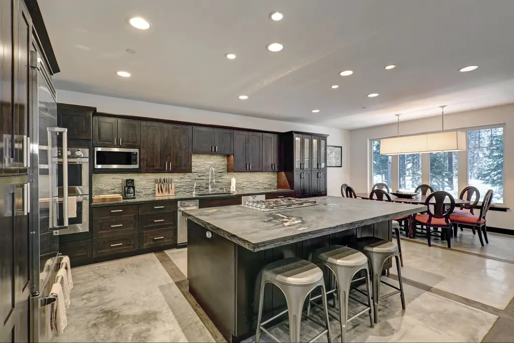
Wide kitchen with dark stained cabinetry and a long stone topped island, opening to a dining room with bare winter trees through the windows

Problem: tiny laundry room, mudroom needed

One room being asked to do two jobs

The client was frustrated with a tiny laundry room that was also serving as a makeshift mudroom for her two active young boys and her husband. Nothing about the room was going to fix that on its own, because the problem was not the room. It was the assignment.

Key design elements

  • Took over the existing home office next door and converted it into a large laundry room.
  • Turned the previous laundry room into a functional mudroom, which is what the family needed it to be all along.
  • Moved the home office into the formal living room, a space that was not being used very often.

Three rooms swapped jobs and every one of them started working. No square footage was added to the house.

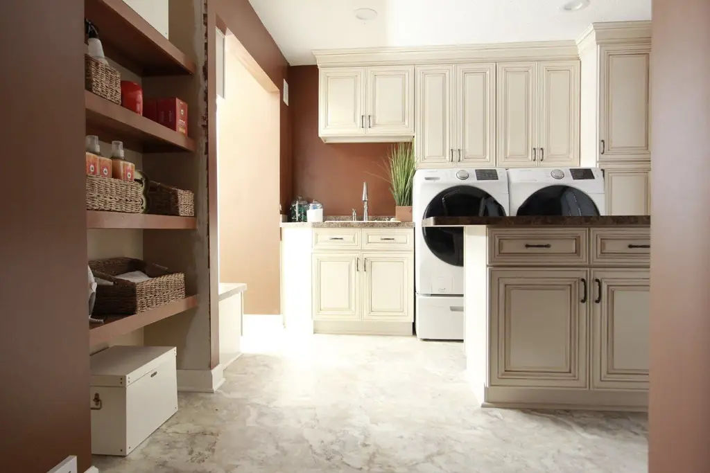
Laundry and mudroom with cream cabinetry, front loading washer and dryer on pedestals, open pantry shelving and a brown accent wall

Problem: recreation space needed

A lower level that had quietly become storage

This young family was not enjoying their partially finished lower level. It had turned into a catch all for surplus pantry items, miscellaneous exercise equipment, and some toys and games the children used on occasion. The brief was to make it inviting, organised, and a space the entire family would actually use.

Key design elements

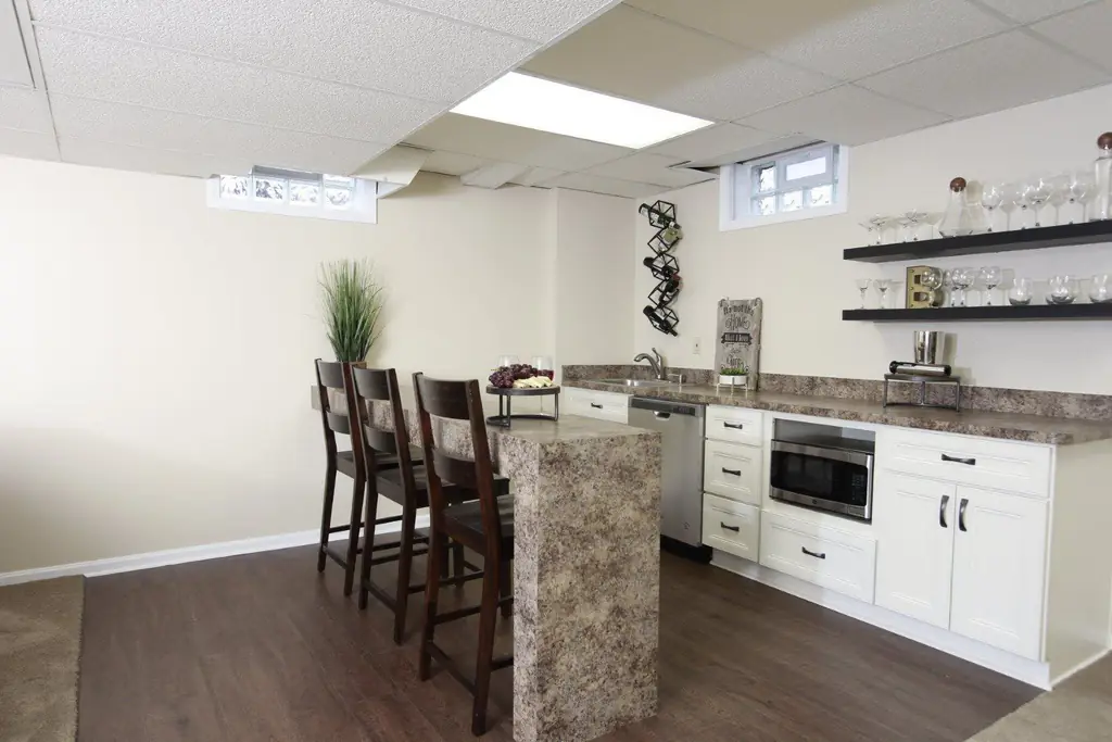
  • Installed a kitchenette wet bar area with a space saving floating bar for seating.
  • Gave the exercise equipment a dedicated area instead of a corner.
  • Built in real pantry storage for the overflow that had been living on the floor.
  • Left room for a large sectional, which is what makes it a movie night room rather than a basement.

The lower level went from the room nobody went into to the room the whole family uses.

Finished lower level with a granite topped bar, three bar stools, a wine rack and a wet bar kitchenette

Problem: small dated kitchen

Borrowing height and borrowing a wall

These clients wanted to maximise the space in a small kitchen. The room was not going to get any bigger, so every move had to be about making the space they had feel larger and work harder.

Key design elements

  • Removed the soffits to create the feel of a larger, more expansive room.
  • Created an opening into the adjacent living room and installed counter height seating, for a more open feel and better flow between the two rooms.
  • Installed a banquette in the eating area to make the best use of a small footprint.
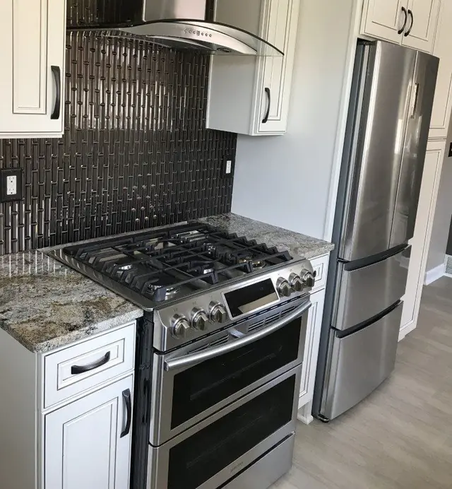
  • Laid the backsplash tile vertically to give the illusion of height, in keeping with the removed soffits and the forty two inch tall wall cabinets.

Nothing was added to the footprint. The room reads as considerably bigger than it measures.

White cabinetry with a black glass tile backsplash, granite counter and a stainless steel double oven gas range

A note on the photographs

Every photograph on this site is from Love Your Nest's own portfolio of Northeast Ohio homes. There is no stock imagery anywhere on it, which is the point: a designer who shows you somebody else's kitchen is showing you nothing.

Your room

Which of these is your house?

If one of those problems sounded familiar, that is the conversation to have on the discovery call. Fifteen minutes, no charge, and it ends with a straight answer.